
MOSSBURN DISTILLERS & BLENDERS
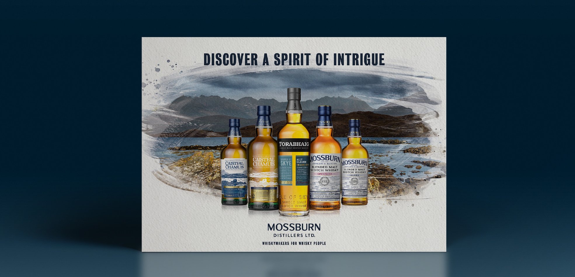
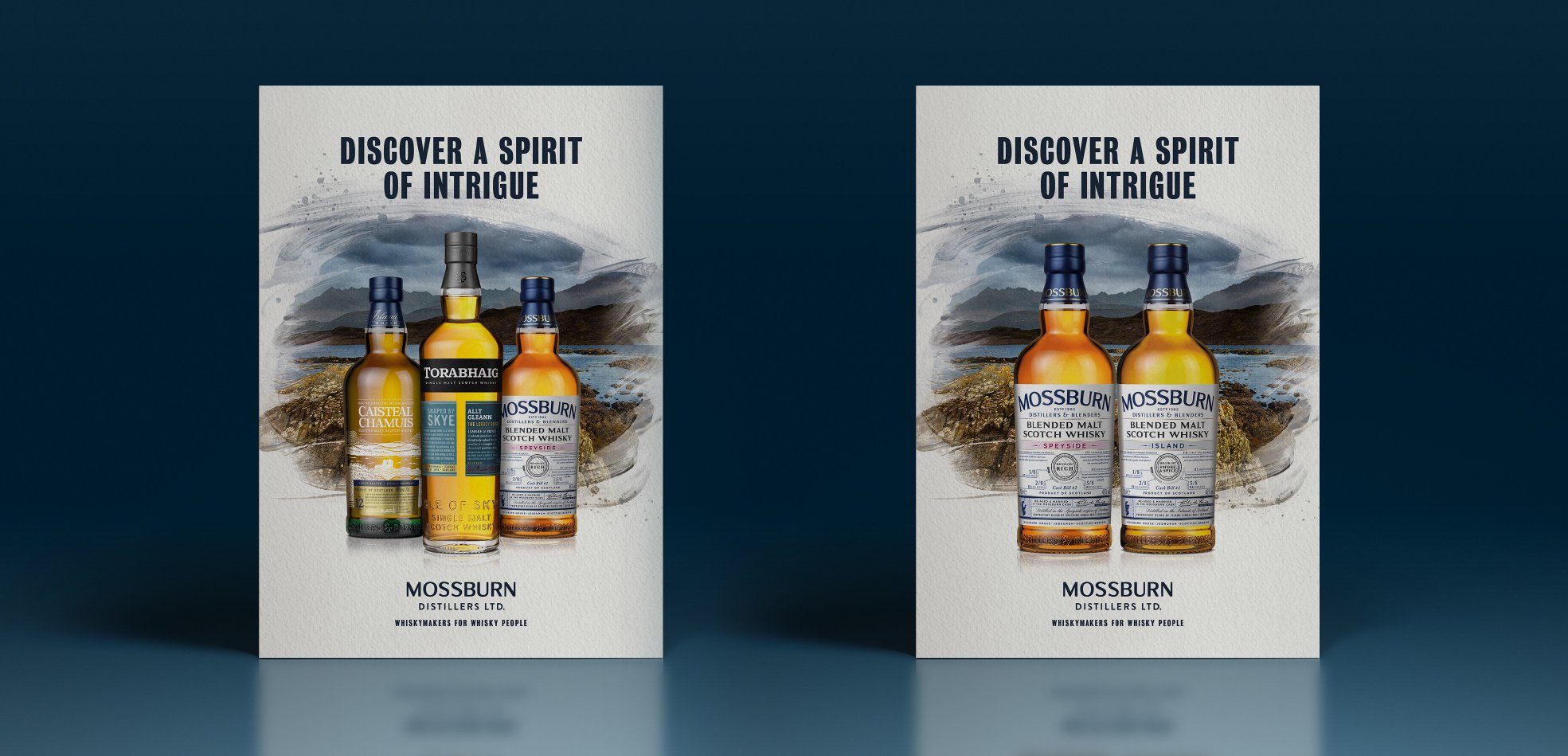
We designed a key visual for flexible use across a portfolio of whiskies
We created an impactful Key Visual within which one or more next-generation Scotch whiskies could be placed against their rugged place of origin.
Key Visual | Design Direction

THE CHALLENGE
Mossburn Distillers & Blenders owns a broad portfolio of Scotch whiskies including both single malts and blends.
With different positionings, target consumers and individual brand identities, the challenge was to bring harmony to the whole portfolio, with an approach that was fully flexible for distributors who might want to hero different expressions.
THE INSIGHT
Through our work on the launch of Torabaigh, one of Mossburn’s single malts, we established that Mossburn could proudly claim to be ‘Whiskymakers for Whisky People’. Its portfolio draws unity from every brand doing things ‘The Mossburn Way’.
We knew we had to stay authentic to that thought – and to the provenance of the whiskies themselves – to develop a successful and authentic creative direction.
KEY VISUALS
THE APPROACH
Our creative exploration suggested a number of different design routes and messaging approaches. We refined these in collaboration with the Mossburn brand team to ensure we developed a comms direction that “felt like them”.
Both the design and the messaging needed to capture the creativity found in each of the whiskies themselves.
THE WONDER
Taking an artistic approach that balanced strength and clarity resulted in strong and relatable imagery.
The Key Visual was developed in a way that allowed SKUs to be swapped in and out, allowing full flexibility for distributors and markets without compromising creative integrity.
Both the client and the creative team fell in love with ‘Discover the Spirit of Intrigue.’


