
CONNEMARA GOLD
REDEFINING IRISH WHISKEY FOR A NEW MARKET
How Wonderworks evolved heritage brand packaging whilst remaining true to its roots.
Creative Branding | Brand Launch | Packaging Design
The Challenge
Making Connemara Gold approachable without losing its character
Connemara already had strong equity amongst whiskey enthusiasts, driven by its distinctive lightly peated profile and Irish heritage. However, there was an opportunity to create a more welcoming entry point for younger drinkers entering the category.
So, it was our job to make the brand feel more approachable to a new audience by uncovering what already made the brand distinctive and express those qualities in a way that felt warmer, more accessible and for the modern drinker whilst staying true to the landscape, character and existing label architecture.

THE APPROACH
Crafting Packaging with Meaning
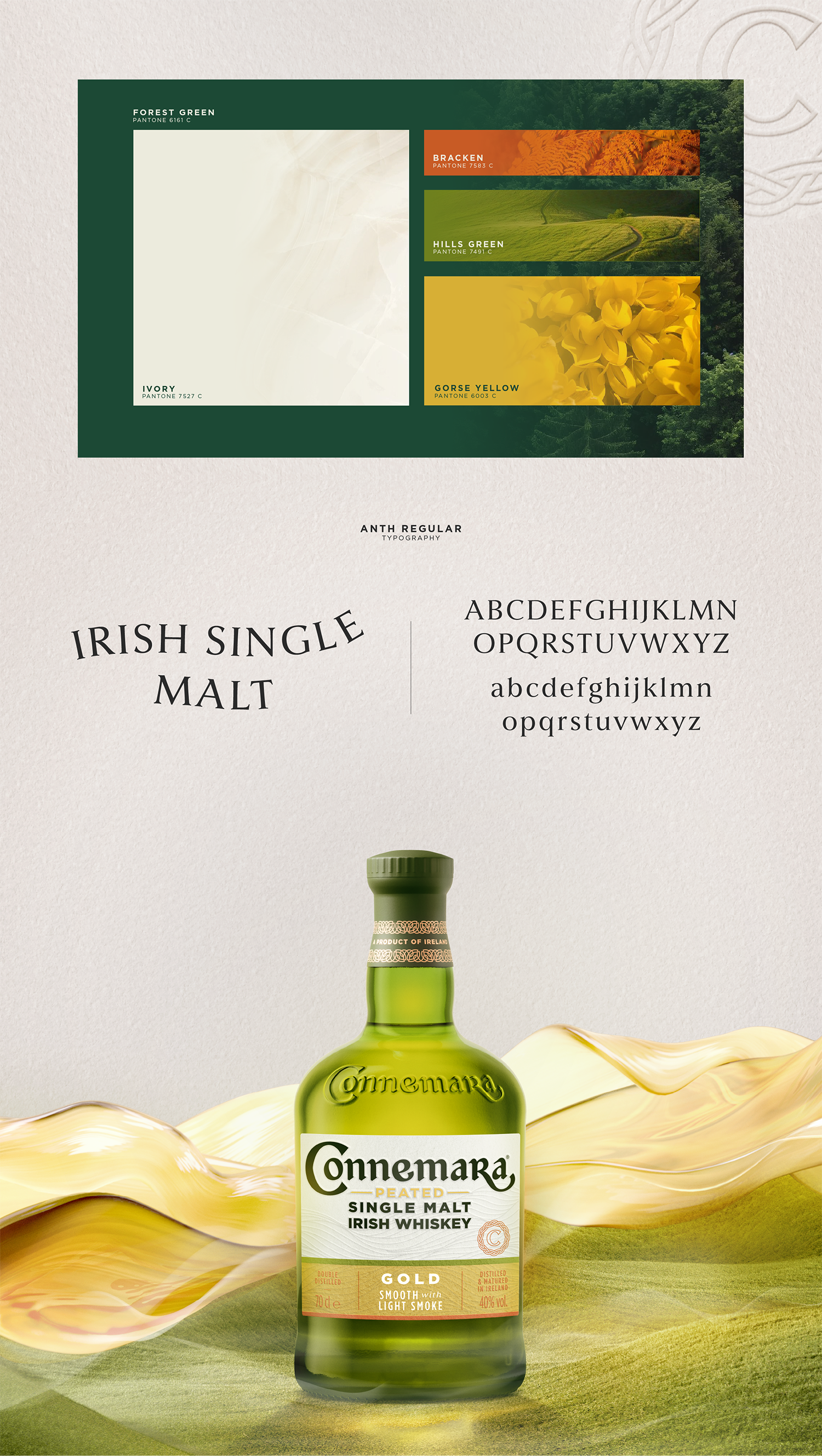
For heritage brands, evolution works best when it builds on what's already there. Rather than introducing entirely new symbols, we focused on strengthening the visual assets that could become recognisable shortcuts to the Connemara story.
This included refining the wordmark, developing a more cohesive visual identity and creating a distinctive signifier inspired by the Connemara "C", Celtic craftsmanship and the surrounding landscape. Every element was designed to feel considered and connected, helping create a brand world that could stretch beyond a single product whilst maintaining a strong sense of consistency.
Combining Flavour and Design
Connemara Gold was developed as a smoother, more approachable introduction to the brand. We explored how flavour could be translated visually through colour, materials, texture and hierarchy.
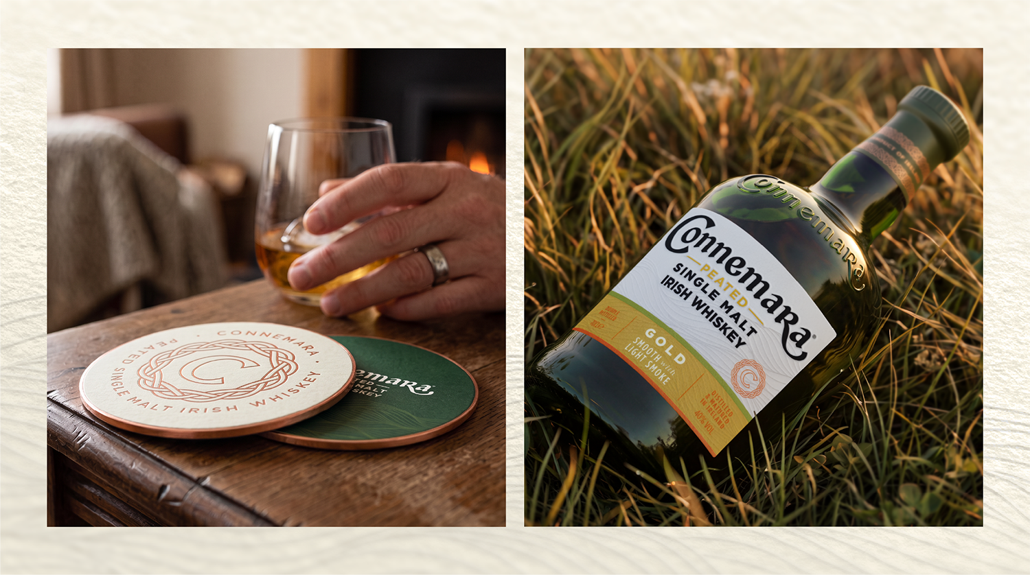
Warm golden tones helped signal smoothness and generosity. Refined typography balanced craft with accessibility. Tactile finishes added depth and premium cues while subtle details throughout the design helped reinforce the whiskey's lightly smoky character.
The result, a bottle that feels inviting to a new generation of whiskey drinkers without losing its credibility and alienating existing brand fans.
The SOLUTION
Connemara Gold became the first expression to bring the refreshed brand world into market.
For us, this was never just about how the pack looked. It was about capturing what makes Connemara Gold special and strengthen the entire brand within new markets.
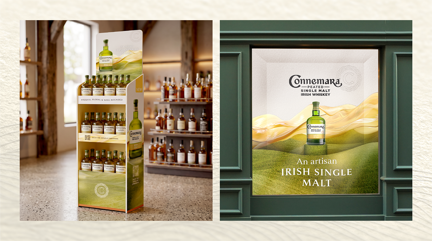
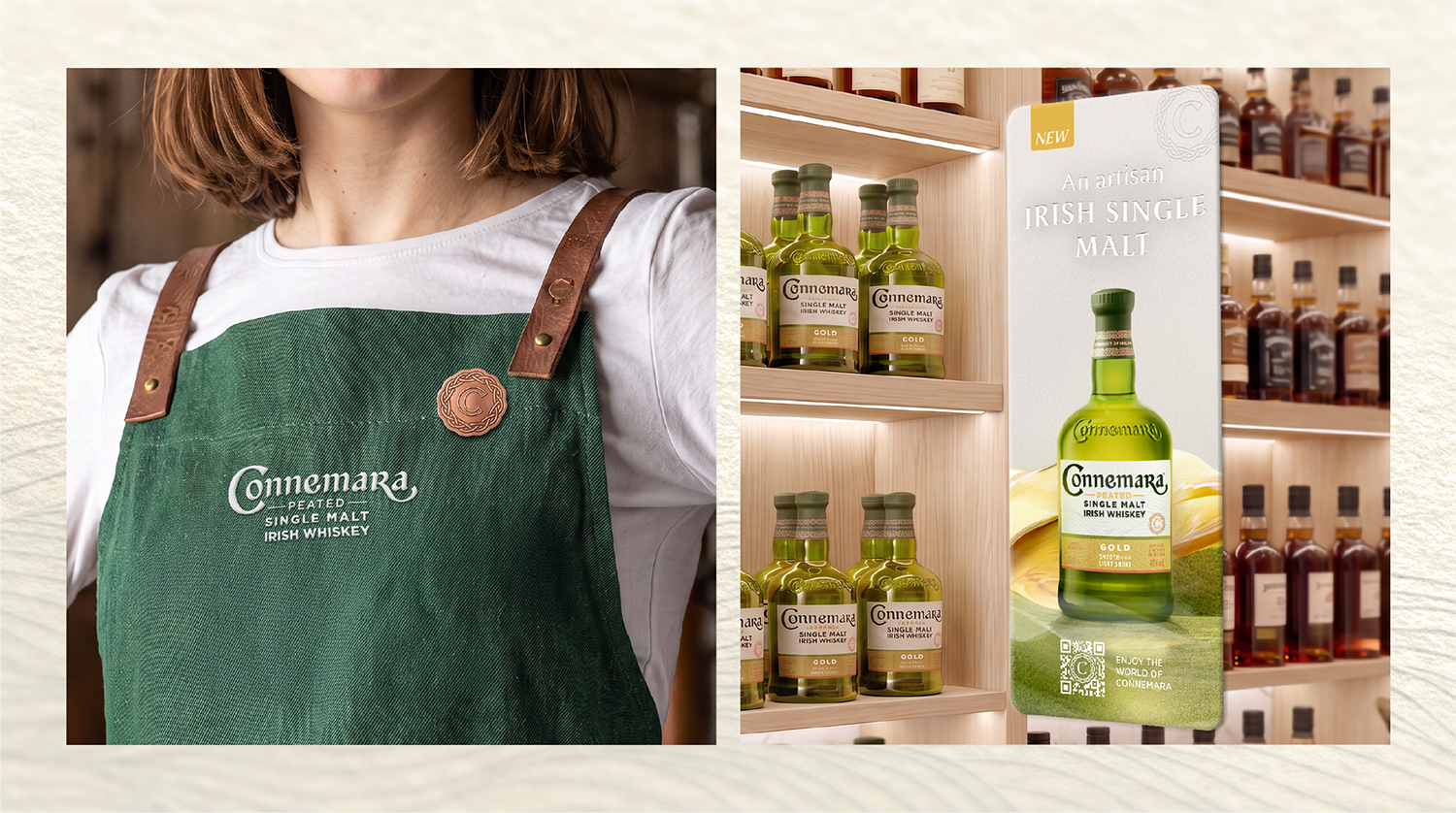
From naming and identity through to packaging and retail activation, every touchpoint was designed to work together as part of a cohesive system. The packaging architecture was refined to improve clarity and consistency across the range. New visual cues strengthened navigation and accessibility, whilst premium finishes, updated hierarchy and distinctive brand assets created a more modern expression of Connemara.
Beyond the label, we developed launch assets to extend the visual world into retail, creating a more impactful and recognisable presence wherever consumers encountered the brand.
Seeing the work out in market is always the most rewarding part, and we're excited to watch the next chapter of the Connemara Gold story unfold.
Get in touch with us today!
Got a brand challenge of your own? As a creative drinks agency, we’re here to help. We'd love to chat.